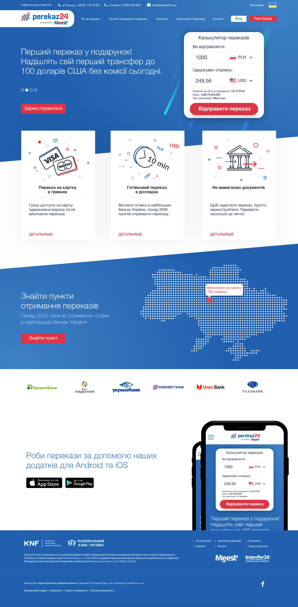
Money transfer service
Why?
Initially, the product was developed as an MVP to test and assess the demand. When the product demonstrated positive results, the product owner decided that it was time to create a serious product ready for market release.
Challenge
A product that deals with user finances requires an interface that is clear and intuitive for everyone. It was essential to consider potential constraints and laws of other countries and provide information about them to users.
There are numerous competitors and similar products; the goal was to study them and make our product better.
Design Process
Market research and competitor analysis:
After the design brief and interviews with the client, the decision was made to conduct market research.
This was crucial to identify constraints, market size, market trends, and evaluate needs.
As mentioned earlier, this product has competitors that have been on the market for a long time. I conducted a competitor analysis and gathered data on four main SWOT metrics (Strengths, Weaknesses, Opportunities, and Threats). After conducting the competitor analysis, I collected and analyzed data, identified areas for improvement.
User interviews:
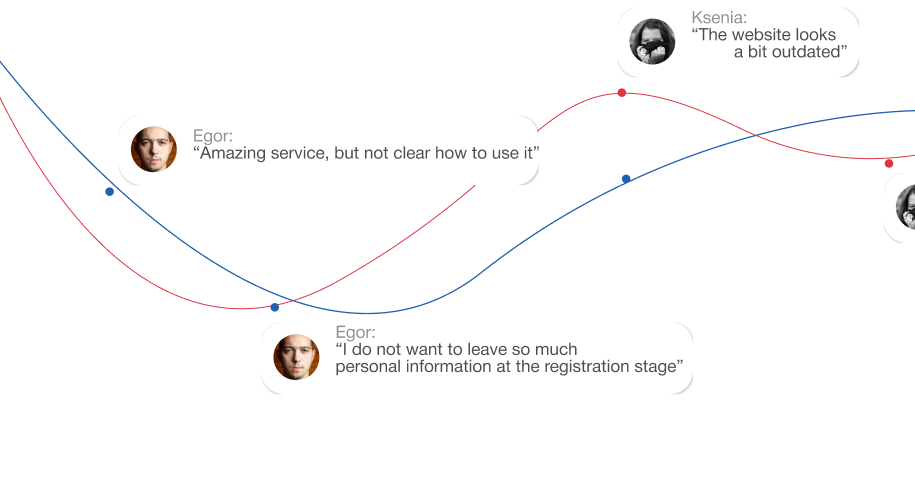
Another interesting aspect was that we were able to interview a small number of users of our competitors and understand the problems users encounter when using the competitive product. Following UX metrics were tracked:
Happiness
Engagement
Adoption
Retention
Task success
Research results:
As we know, despite the similarities, methods of marketing and usability research do not work the same way.
Firstly, they address different questions, and secondly, they provide completely different answers for designers and marketers. However, both of these research methods brought us good results in the future, influencing the development and sustainability of the product, and minimizing business risks.
Research & Discovery
Understanding the Constraints:
Since direct access to end-users was not possible, I relied on secondary research and stakeholder input to identify potential usability issues. This included:
Task Analysis: Breaking down the operator’s tasks into smaller steps to identify areas where the interface could simplify or streamline actions.
Regulatory Compliance: Mapping out the safety regulations for each country to ensure the design could adapt to different requirements.
Accessibility Matters:
Given the high-stress environment in which the application would be used, accessibility was a key focus. I conducted low-light usability testing and ensured that the interface was clear and legible under various lighting conditions.
Design & Functionality
The fun begins:
Based on our research, the target audience was identified, along with the main product requirements and a content plan.
User flows and a content map were created.
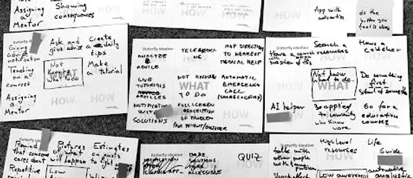
Afterward, I developed the initial wireframes and a prototype, conducted usability testing, and user testing with potential product users.
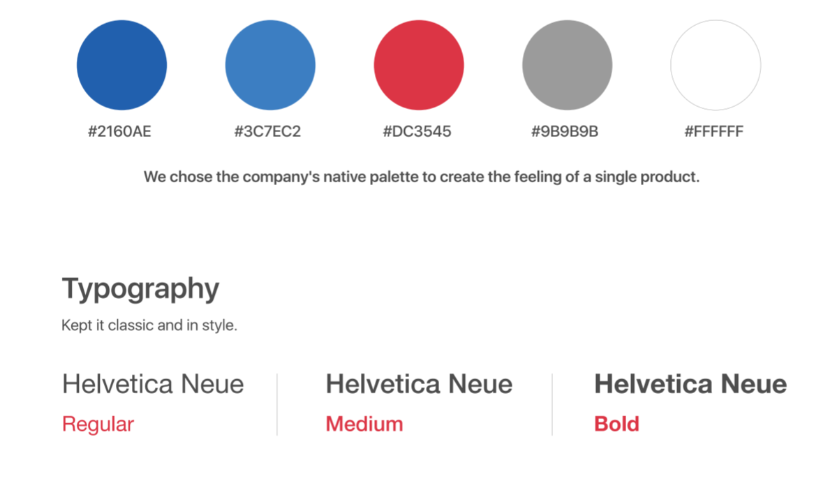
After two iterations, I was ready to proceed with developing the UI style based on the company's brand book, design system, and preparing UI layouts.
Result
As a result, we obtained a web and mobile application that is actively used by thousands of users every day.
Unfortunately, I cannot disclose user growth figures, but the UX metric "Happiness" for current users stands at 85%, and the "Retention" metric is only 14%.
This indicates that users not only actively engage with the application but also remain satisfied with its use over the long term.
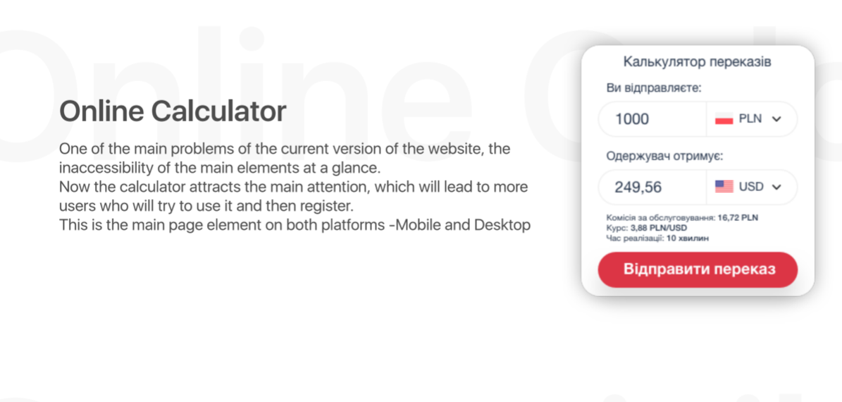
The product is designed to simplify the transfer of funds between countries without leaving home, using your phone or computer.The process is secure and user-friendly, ensuring that even those unfamiliar with digital transactions can easily navigate the system.
